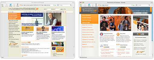
My office at work is fairly small. Windowless. Tidy. Lit by three underpowered lamps. Spartan. The back wall is dominated by a large dry-erase board that, for the past four months, has been covered in brown scribbles, which is a kind way to describe my handwriting. Sometime back in the fall I wrote myself a long to-do list on the board, and in the weeks since I have slowly but steadily crossed off each item. A brown stroke through each brown scribble. On Wednesday morning, just before 7 am, I erased the board.
Or maybe this is a better way to begin . . .
Back in July, when I attended the Seattle Web Design World conference, a woman with whom I was having a nice enough conversation, gave me the most pitiable look when I told her why I was there.
“I was just asked to redesign the University of Tennessee homepage, and I’m looking for any help I can get.”
“Really? [pitiable look] I’m so sorry. [pause] Good luck with that.”
Most high-traffic websites serve a very specific function. No matter how much it continues to evolve, for example, Amazon still sells things, and so its chief concern is getting its users as quickly as possible to that thing they want to buy, while also showing them other things along the way that they didn’t know they wanted to buy. A university homepage is a design nightmare because it must simultaneously address the distinct (and often competing) purposes of its many and varied audiences. For the sake of simplicity, I’ll divide them into two camps: those within the institution (administrators, faculty, staff, and students) and those outside of it (prospective students and their parents, alumni and donors, legislators, people in the surrounding community, sports fans, business and research partners, journalists and media, other educators and scientists and institutions, people with an interest in culture and the arts, job-seekers and employers, and the list goes on and on). The site must also be navigable, which, relatively speaking, is the easy part.
Previous incarnations of the University of Tennessee website were very efficient, particularly in regards to navigation, but they didn’t “tell the UT story.” Taking that as our cue, we looked to the standard university menu buttons — Future Students, Faculty & Staff, Academics, etc. — as themes or chapters in an anthology. Rather than simply compiling lists of links, we’re now using those pages to spotlight people, events, and resources from the university community. I kept imagining a user who knew little about the university — a high school junior taking her first peek into college life, a researcher in China mulling over his post-doc options, a new Knoxvillian trying to figure out where we’ve hidden all the culture — and my hope was that, by clicking on each of those main menu buttons and watching the spotlights rotate through, he or she would get a good sense of what the university has to offer.
There were other design challenges particular to UT Knoxville, the most significant of which is this:
which I toned down slightly:
and which, in predictable web 2.0 fashion, soon became:
Accepting a web design position at a university means surrendering whole swaths of the color palette. For those of you not acquainted with college athletics in the States, the University of Tennessee Volunteers are also known as “The Big Orange.” Orange is not just our signature color; it’s our only color. To make matters even more complicated, the blues and purples that naturally compliment orange are completely off-limits. Why? I bet the sports fans know. Mixing orange with light blue makes us look like Florida; dark blue drifts into Auburn territory; and purple is Clemson’s secondary color. So orange it is. And a lot of it. We settled on a “blue sky” campus photo for the header, which is a bit of cheat, but an effective one, I think.
Another significant complication was the UT wordmark, which was a mandated element of the university system’s larger branding initiative:
It’s an elegant and traditional wordmark that employs an elegant and traditional serif font (Goudy Old Style). It looks great on business cards, letterhead, and signage. It doesn’t looks so good on the web, where the delicate vertical and horizontal lines in each letter inevitably bleed and lose their contrast. With a limited palette to work with (“Did you try setting it against an orange background? I bet that would make it really pop!”), I settled on gradiated shades of grey. It was the best of several less-than-satisfying options.
Some of the other major changes:
- The site is web standards-compliant and displays properly in IE 6. (Thanks to Jason for all of the debugging help.)
- We’ve integrated a campus events calendar into the site and are using it to create and broadcast audience-targeted RSS feeds.
- Using tracking data, I’ve restructured the subpage navigation to give greater prominence to the most popular links (Quick Links) and to bury the least popular (see the “expand the full list” link near the bottom of the Current Students page, for example).
All in all, I have to say I’m pretty damn proud of it.


