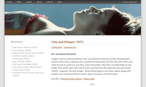
Welcome to Long Pauses 9.0. I’ve always added .0 to my version numbers out of some odd devotion to conventional, software-related naming conventions, but I suspect that this version might actually experience the occasional upgrade before the next full-blown redesign. Be on the lookout for 9.1.
I had two main goals this time out. First, I wanted to return to the conventional blog format. As I said in my announcement of the last redesign, the widescreen format was an experiment — a usability study, really. And what I discovered was . . . it wasn’t as usable. I did like having my links grouped together, and it all worked perfectly well on large, widescreen displays, but the scrolling-right got old. Also, I got tired of having the main content pressed to the left side of the screen. One reason I haven’t posted much lately is because, for the first time in nearly five years, I got tired of looking at Long Pauses.
Second, and more importantly, I wanted to stretch my CSS skills a bit. It’s not perfect yet, but I’m fairly proud of the coding here. The buttons and the rollovers (including the Song of the Moment) are all controlled by CSS. And it all works perfectly in Explorer for Windows, even when the browser’s text size is set to “largest.” The only design element that is negatively affected by IE is the transparency of the Song of the Moment image.