Tamalpais (Chris Kennedy)
Toronto filmmaker Chris Kennedy is a familiar face at Wavelengths. His films Memo to Pic Desk (co-director, ’06), the acrobat (’07), and Tape Film (’07) were all screened in the program, and my limited sense of him based on those projects was that he was still experimenting (pun intended) with the material of movie-making but hadn’t yet successfully married form to an equally compelling concept. Tape Film, for example, is fascinating to look at — it’s a disorienting and super-saturated self-portrait — but it feels scholastic, like an assigned exercise in the mechanics of handprocessing and stock manipulation.
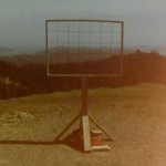
Kennedy’s latest contribution to Wavelengths, Tamalpais, represents a significant step forward for him, I think. About two-and-a-half minutes into the fourteen-minute film, we see in the distance a lovely composition of the green hills north of San Francisco; in the foreground, a handmade wooden frame in the classic movie ratio, 4:3, the same as the film itself. This shot puts all that comes before it in some much-needed perspective. The wooden frame is cross-sected by ten wire lines, six vertical, four horizontal, that divide the framed space into 35 smaller frames, and it’s only in hindsight that we realize each of the opening shots in the film was inspired (probably the wrong word) by one of those smaller frames. Like the twelve-tone composers of the early 20th century, though, it’s what one does with the given notes that determines whether a particular work is successful or pedantic or (insert your own evaluative adjective here), and Kennedy’s real achievement is at the level of individual shots, which are often beautiful and demonstrate a curious deftness with focus and depth of field. Kennedy recycles the technique six or seven times, creating slight variations on his landscape theme and shepherding his audience through shifting relationships with the material, from the simple pleasure of the opening images to the puzzle-like gamesmanship of his structuralist conceit and back, finally, to the beauty of his shot-making.
Hotel Roccalba (Josef Dabernig)
Until watching Hotel Roccalba and then immediately googling Dabernig to learn more about him, I’d forgotten about his previous film, Lancia Thema, which screened in Wavelengths three years ago. I remember wondering at the time why Andrea Picard was so enthusiastic about him — the film struck me as slight and offbeat, like a Stella Artois ad — but Hotel Roccalba may have made me a believer. The film opens on a shot of two women knitting outside. He then cuts to others in the courtyard — an old man chopping wood, a bicyclist repairing his bike, a woman in a lawn chair. It’s only after introducing his characters — and make no mistake, these are staged tableau, this is a fiction — that Dabernig situates them in space by planting his camera on a tripod and panning 180 degrees.
Hotel Roccalba is also relatively slight and offbeat, funny even, but the execution is so precise and Dabernig’s cutting so angular and shocking that it feels right at home in Wavelengths. My favorite section of the film involves an elderly man and a put-upon bartender who wouldn’t be out of place in Satantango. As in the opening sequence, Dabernig reveals their relationship gradually and in splintered fragments, cutting from a series of medium one-shots to a long-range, wide-angle shot that provides something like an objective perspective on them both. A note to cinema studies teachers: this would be a great piece for a unit on editing.

