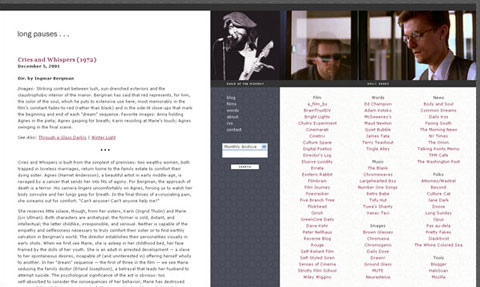
Welcome to Long Pauses (version 8.0). Consider this redesign a usability study. The centered, two-column blog format has become the industry standard, so to speak, but I’m not sure if it best mirrors how I actually interact with this and other sites. I seldom click through the long list of links (scroll, scroll, scroll) on other blogs, for example, but I click through my own collection of “daily reads,” um, daily, and so I wonder if having them collected in one spot, out of the way of the main blog content, will positively affect the user experience.
I’ve also decided to publish only the most recent post on my front page. I like the idea of having a single white page to write on. It better reflects my own conception of Long Pauses, which should be considered a journal or a diary, a workspace for immediate reflection and experimentation. (Each time I redesign Long Pauses, I spend the first two hours convincing myself that graphics, colors, and columns aren’t just distractions from what really matters — the words. But then the wannabe-designer in me takes over.) To aid navigation, I’ve created a drop-down menu in the content area that will direct you to any of the ten preceding posts.
I suspect that one downside of the redesign will be a slight reduction in the number of reader comments. Once a post drops from the front page, readers will be less likely, I assume, to continue old conversations. Or maybe not. I’m eager to find out how/if the interactions change. For what it’s worth, I’ve turned on email notifications for the first time, so I’ll always know when someone has posted in the archives. I promise to do my best to respond.
One thing that bothers me about the redesign, though, is that it includes a simple, three-column table, a major no-no in CSS design. It’s there for one reason: Internet Explorer for Windows, which is still the browser of choice for most Long Pauses readers and which can’t seem to solve its floating div problem. I tried every trick in the book, but couldn’t make it work to my satisfaction. Any CSS guru who wants to tweak my code will forever have my gratitude.
I just looked at the redesign for the first time on our office G5 with a 30-inch Cinema Display. I like it. Feedback, as always, is greatly appreciated.