Or, A Study in Parenthetical Asides
I was in my twenties when I built the first version of Long Pauses. In a move that still gives me occasional pangs of regret, I’d decided a few months earlier to give up my graduate research fellowship and take a full-time job as a multimedia developer and instructional designer, figuring that a steady paycheck and a boring day job would bring some stability to our lives while also keeping me motivated to study for my comprehensive exams. I must have been under the spell of Nathaniel Hawthorne, who managed, miraculously, to write quite a few good stories after tolling away all day at the Custom House.
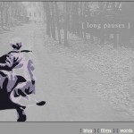
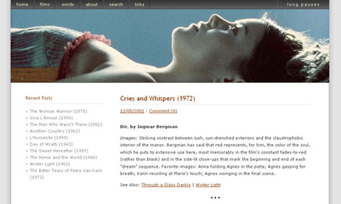
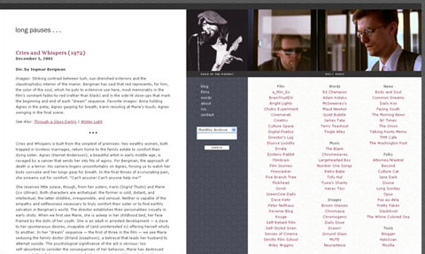
Long Pauses was intended to be a workspace for testing out ideas, both as a writer and a web developer. Looking back over the hundreds of posts contained within it today, as I’ve done in recent months preparing for this relaunch, I think it’s met that goal. A quick scroll through the various design iterations is a useful snapshot of web design trends over the past decade – from table layouts and FONT tags to javascript, cascading stylesheets, and database-driven content management. (I’ll always remember 2002-2006 as the days of 11px Verdana.) Technically, the word “blog” predates Long Pauses by a year, but I’d certainly never heard it when I was poring over my copy of The Quickstart Guide to HTML. (I didn’t move to Blogger until Version 5 and didn’t add commenting until Version 7.) My writing has evolved, too, though not as impressively as I would’ve liked. It’s still too precious, too littered with em-dashes, and too reliant on pseudo-intellectual space-fillers. (I hereby promise to retire the word “defamiliarize” and, instead, make a greater effort to describe, specifically, how a particular work of art defamiliarizes the world.)
I shelved Long Pauses in 2010, soon after my daughter was born, because, frankly, the web had become boring. Like everyone else, I’d made the move to Facebook and Twitter, both of which facilitate the kind of small talk I hate so much (and am so very, very bad at) in real life. This relaunch is an effort to steal back those hours of my life, to rediscover silence and the hard work of writing, and to stop giving a shit whether that person I haven’t spoken to in twenty years likes my latest photo of Rory. On a more practical level, I also want to reclaim ownership of my content and to file it away in a searchable, logical, movable archive.
Launching a blog in 2012 is nothing like I experienced eleven years ago. I remember sitting at my little cubicle at work back then, exchanging emails with Pascual Espiritu, whose website, Strictly Film School, was one of the very few places outside of usenet groups and discussion forums where I could read about contemporary foreign cinema on the Internet. I ate up her advice and mimicked as best as I could her design aesthetic for Version 1 of Long Pauses. I discovered just a few days ago, even, that longpauses.com was still associated with the antiquated domain registration service she recommended to me then.
Over the next few years, the film blogosphere slowly evolved, thanks in large part to free, user-friendly services like LiveJournal, TypePad, and Blogger, and along with it came a new community of writers, many of whom have since become friends. Revisiting those days has made me all kinds of nostalgic. For good and bad, the early bloggers were creating a new and vital communications medium. (I was notified a year or two ago by a graduate researcher that I’ve been credited officially with coining the term “blogathon.” My name and Showgirls are forever linked, apparently – and in the most wonderfully esoteric way!) When I mentioned on Twitter that I was rebuilding Long Pauses, one friend wondered how we had ever found the time to write so much, and my off-hand answer was that we blogged instead of pissing our efforts into the social networking ether. That’s at least partly true, I suspect. Just as likely a culprit is the exponential growth – the goddam deluge – of content that now threatens to drown us all. There’s too much to digest and reflect upon, so we skim it all and retain little more than trivia. (Cue the Portlandia “Did you read?” sketch.)
Generally speaking, what remains of the original filmblog dialogue has relocated to Twitter and to sites that grew out of the blogosphere but now more closely resemble traditional publications with editors and teams of contributors – places like Indiewire, Mubi, Slant, the AV Club, and Fandor. Don’t get me wrong: film blogs still exist in large numbers, but the discussion has moved (or evolved, or in some cases atrophied). Girish’s site is one of the few living monuments to a kind of conversation that was once more common and that I now miss. (I love that Girish still uses his original Blogger template. He told me once that he briefly considered changing it but decided that it’s become too essential to the voice of his blog.)
None of that is news, really. But what surprised me as I combed through the Long Pauses archive is that vast swaths of the original blogosphere are gone. Many of the sites I once included on my blogroll of “daily reads” have been deleted entirely, and the authors have vanished right along with them. Presumably, they’ve settled into new phases of their lives – like me, they’re now raising children or managing greater responsibilities in their professional lives; like me, they’re in their forties – while others simply lost interest after a short-lived burst of blogging enthusiasm. The Wayback Machine salvages bits and pieces of the wreckage, but the Internet, it turns out, is an ephemeral place. Moreso than I’d imagined. (I was disappointed to discover a few days ago that someone has beaten me to the punch: Internet Archaeology is already a thing.) Our virtual world is indeed a palimpsest.
This gone-tomorrow-ness of the Internet is another of my motivations for relaunching Long Pauses. For archival purposes (and at the risk of offending friends and editors) I’ve added essays and interviews to this site that were originally published elsewhere, and I’ve noted them as such. I can control my database; others are a fickle business. I’ve also made the move to WordPress and have tagged and categorized every single post, giving Long Pauses its first-ever relational structure, along with a slightly more usable main menu. (The term “Debris” comes from my long-standing habit of creating hodgepodge posts called “Miscellaneous Debris.” “Debris” includes all posts not categorized as “film,” “music,” or “words.” Two other recurring themes from the archive — Songs of the Moment and Mix Tapes — have also found their way into the navigation.)
And one final word on Version 13: This is the first iteration of Long Pauses that I didn’t design by hand. It’s a modded version of Slate from Okay Themes. Why did I buy a template? I’m not a web designer. Not really. I was supposed to be a professor, after all. I stumbled backwards into this career and have only in recent months worked my way, finally, into a job title that more accurately describes what I’m good at: communications director. I plan to build my first responsive design this fall, and I’m beginning to know my way around the WordPress functions.php file. But for the time being I’m content to benefit from others’ talent and devote my efforts, instead, to learning how to be a writer again.
As always, thanks for reading.
